
TL;DR
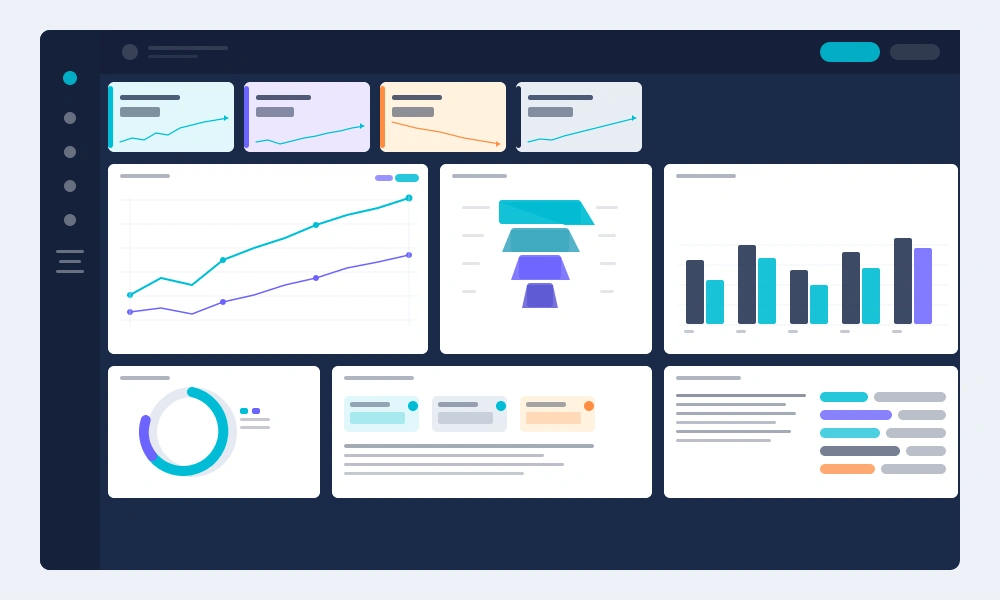
- A KPI dashboard is a real-time visual interface that aggregates performance metrics across channels, campaigns, and funnel stages into a single decision-making surface.
- Its strategic value isn’t visualization — it’s the speed and confidence it gives revenue teams when allocating budget, escalating underperformers, and attributing pipeline to channel mix.
- Most dashboards fail not from poor design but from poor data inputs: without contact-level attribution feeding the underlying data layer, the metrics displayed are structurally incomplete.
What Is a KPI Dashboard?
A KPI dashboard is a centralized, live reporting interface that displays key performance indicators across marketing, sales, and revenue functions in a single consolidated view.
Unlike static reports, dashboards update continuously — pulling from CRM records, ad platforms, analytics tools, and attribution systems to reflect current performance against defined targets.
For marketing leadership, the dashboard operates as both a diagnostic tool and a strategic compass. It surfaces when CPL is trending above benchmark, when MQL-to-SQL conversion rates shift, and when channel-level ROAS warrants reallocation — all without requiring a manual data pull.
The distinction between a reporting dashboard and a true KPI dashboard is intentionality. A KPI dashboard is built around decisions, not displays. Every metric shown should map to an action that a CMO, VP of Marketing, or performance lead can take within 24–48 hours.
Test LeadSources today. Enter your email below and receive a lead source report showing all the lead source data we track—exactly what you’d see for every lead tracked in your LeadSources account.
Core Components of an Effective Dashboard
Architecture matters as much as metric selection. A dashboard built without a clear layer structure becomes noise within weeks.
The three functional layers are:
- Executive summary layer — Revenue influenced, pipeline generated, blended CAC, and MQL volume vs. target. Designed for 60-second consumption.
- Channel performance layer — CPL, conversion rate, and ROAS broken down by channel, campaign, and medium. Where budget decisions get made.
- Attribution layer — First-touch, last-touch, and multi-touch attribution data mapped to leads, SQLs, and closed revenue. The most frequently under-built layer.
Most marketing dashboards have the first two layers reasonably covered. The attribution layer is where revenue leaks from the model — and where the highest-value insights live.
Why Attribution Data Is the Foundation
A KPI dashboard is only as accurate as the data feeding it. Channel-level aggregates — sessions, impressions, clicks — tell you what happened on the platform. Attribution data tells you what produced revenue.
The gap between the two is significant. According to Forrester, B2B buyers engage an average of 17 touchpoints before a deal closes. A dashboard built on last-click data alone misrepresents the contribution of every touchpoint that isn’t the final one — systematically underfunding channels that influence early funnel intent.
Contact-level attribution resolves this by attaching source data directly to the lead record: channel, medium, campaign, landing page, keyword, and full session path. When that data feeds a KPI dashboard, CPL and CAC calculations reflect actual acquisition economics — not platform-reported estimates.
This distinction determines whether a CMO is optimizing toward real ROI or toward a model that flatters whichever channel happens to be last in the click chain.
Key Metrics to Include by Funnel Stage
| Funnel Stage | Metric | Why It Belongs |
|---|---|---|
| Awareness | CPL by channel | Identifies cost-efficient lead sources before MQL qualification |
| Consideration | MQL volume + MQL→SQL rate | Measures quality of lead supply delivered to sales |
| Decision | SQL→opportunity rate, deal velocity | Surfaces friction in the sales handoff and pipeline progression |
| Revenue | CAC by channel, LTV:CAC ratio | Determines sustainable acquisition economics per source |
| Attribution | Revenue influenced by channel | Connects marketing spend to closed-won outcomes |
The LTV:CAC ratio deserves particular attention at the executive layer. A ratio below 3:1 signals unsustainable acquisition costs; above 5:1 often indicates under-investment in growth. Both scenarios represent a budget reallocation trigger.
Implementation: Building for Decision Velocity
The most common implementation failure is building a beautiful dashboard that nobody acts on. Dashboard adoption correlates directly with how quickly a user can move from metric to action.
A high-adoption build follows this sequence:
- Define decisions first. Map every KPI to a specific decision: “If CPL from paid search exceeds $X, we shift budget to [alternative channel].” Metrics without decision triggers are decorative.
- Establish data connections. Connect CRM (Salesforce, HubSpot), ad platforms (Google Ads, Meta), and attribution tracking at the contact level. Surface-level GA4 data is insufficient for revenue attribution.
- Set threshold alerts. Automated notifications when a metric crosses a defined threshold reduce dashboard dependency. The dashboard becomes a confirmation layer, not the monitoring mechanism.
- Design for the 90-second scan. If extracting the key insight takes longer than 90 seconds, the layout needs restructuring. Executive dashboards serve as signal detectors, not analysis tools.
- Establish a review cadence. Weekly for channel-level metrics; monthly for attribution and CAC analysis; quarterly for LTV and cohort performance.
Common Structural Mistakes
Vanity metric inclusion is the most prevalent issue — dashboards populated with impressions, reach, and follower counts that have no direct path to revenue. These metrics crowd out the signals that actually drive decisions.
A second structural failure: siloed dashboards that separate marketing and sales data. When MQL volume sits in a marketing dashboard and SQL data sits in a sales dashboard, the conversion rate between them is invisible to both teams. Unified pipeline visibility is a non-negotiable design requirement for revenue marketing functions.
Finally, static benchmark comparisons. Displaying current CPL without a trailing 90-day trend line removes context entirely. A CPL of $85 is either excellent or alarming depending on whether it’s improving or deteriorating — and a dashboard that doesn’t show directionality is operationally limited.
Frequently Asked Questions
What’s the difference between a KPI dashboard and a marketing report?
A marketing report is a retrospective snapshot — it summarizes what happened in a defined period and is typically static. A KPI dashboard is a live, continuously updated interface designed for in-the-moment decision-making. Reports explain the past; dashboards inform the present and near-term future.
How many KPIs should a marketing dashboard display?
Research from Gartner suggests that executive dashboards lose effectiveness beyond 7–10 primary metrics. The discipline isn’t selection — it’s exclusion. Every metric that doesn’t connect to a budget, headcount, or channel allocation decision should be moved to a secondary layer or reporting view, not the primary dashboard surface.
Can a KPI dashboard replace attribution modeling?
No — and conflating the two is a common strategic error. A dashboard is the visualization layer; attribution modeling is the data logic that determines which channels receive credit for conversions. A dashboard without a robust attribution model underneath it displays accurate-looking data that may be structurally misleading, particularly for multi-touch buyer journeys.
What tools are typically used to build marketing KPI dashboards?
The most common stacks at mid-market and enterprise level include Looker, Tableau, or Power BI for the visualization layer, connected to a CRM like Salesforce or HubSpot as the data source of record. The critical variable is the attribution data layer feeding the CRM — contact-level source data must exist at the lead record level before any dashboard tool can surface accurate channel performance.
How do you handle data discrepancies between platforms in a dashboard?
Platform-level discrepancies (e.g., Google Ads reporting more conversions than the CRM records) are inherent to multi-platform stacks and result from different attribution windows, cross-device tracking gaps, and cookieless measurement limitations. The resolution is designating a single source of truth — typically the CRM — and treating all platform data as directional signals rather than authoritative figures.
How often should KPI dashboard metrics be reviewed?
The cadence should match the decision velocity of the metric. Paid channel CPL and daily lead volume warrant daily or weekly monitoring. CAC by channel, MQL quality scores, and pipeline contribution by source are best reviewed monthly. LTV:CAC ratios and cohort-level attribution analysis are quarterly exercises — reviewing them more frequently introduces noise without adding signal.
Is a KPI dashboard useful for small marketing teams?
Highly — but the scope should match the team’s ability to act. A two-person demand generation team doesn’t need a 40-metric dashboard; they need five metrics tied directly to their budget levers and conversion targets. Dashboard complexity scales with organizational complexity, not team ambition. Simpler builds with cleaner data consistently outperform elaborate builds with inconsistent attribution inputs.